Shimmer
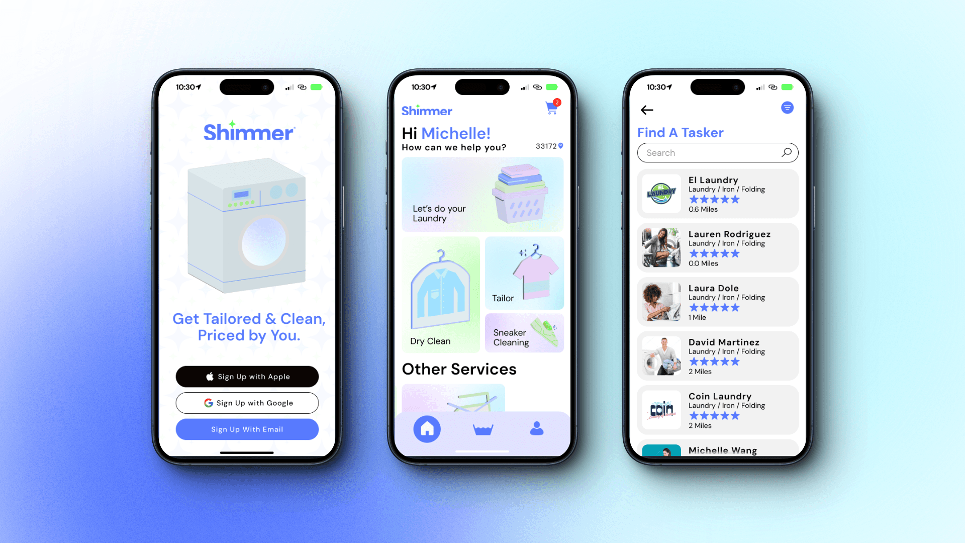
Shimmer is your one stop solution for all your garment needs without breaking the bank.
Industry:
Capstone Project
Role:
Product Designer
Date:
2024
My Role
I’m the product designer for this project. I conceptualized and did all aspects of the research. This is a on going personal project that I’m exploring to see if I can make it come to life.
Problem
Laundry and garment app services have a limited scope and don’t offer enough solutions or fair prices.
Goals
User Goals
A delightful, Consistent Consumer Experience
Ensuring a proper design system is crucial to enabling users to achieve their end goals as efficiently as possible, thus delivering a delightful and consistent consumer experience.
Multiple Services
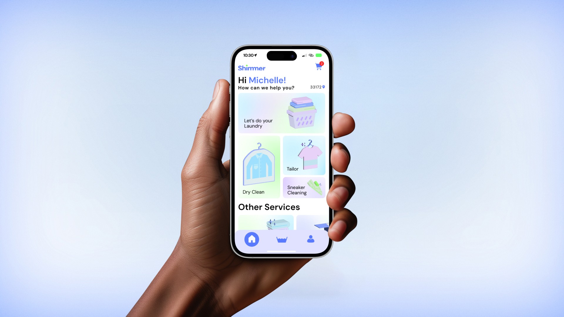
My objective was to offer a variety of services without causing confusion or complexity. These services include:
Laundry services that include delicates and bedding.
Tailoring services, with measurements taken at the customer's doorstep.
Dry cleaning services, with pick-up and drop-off facilitated by local businesses.
Sneaker cleaning services.
Business Goals
New Pricing Model
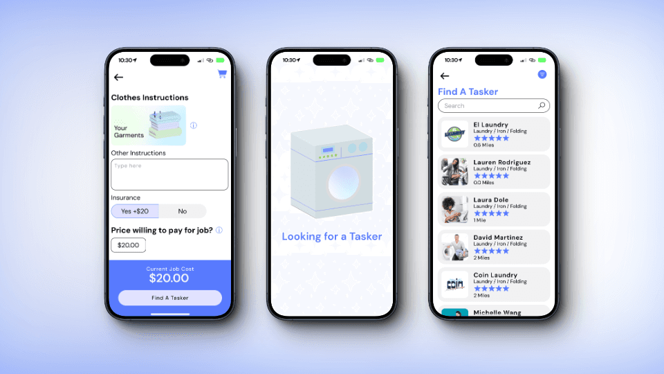
Introducing a pay-what-you-want pricing strategy aimed at providing competitive pricing and defining our position in the market.
A Network of Users
I aim not only to serve traditional laundry facilities but also empower everyday individuals with access to washing machines and dryers to establish side businesses. This approach enhances the accessibility of Shimmer services to a broader audience.
Challenges
Here is a before-and-after comparison of laundry service options. The practice of restraint is crucial in any creative endeavor. In this example, I recognized that I had made the experience too bloated by placing delivery options too early in the process. There is a sense of relief in trimming the excess to create something leaner.
Design

Branding
The song "So Fresh and So Clean" by Outkast served as the mantra behind the feeling and design of this project. This design needed to evoke a sense of cleanliness and brightness, not only through color but also through a clean layout.
Color
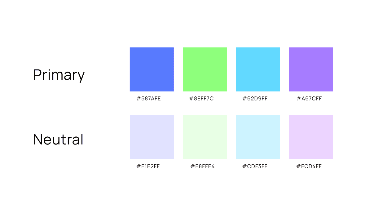
The main color is cornflower blue, chosen with accessibility in mind. This blue can serve as a background, allowing for the use of either black or white text. The additional colors were selected to evoke a sense of freshness. I avoided oranges or yellows to prevent any association with stains.
Typography
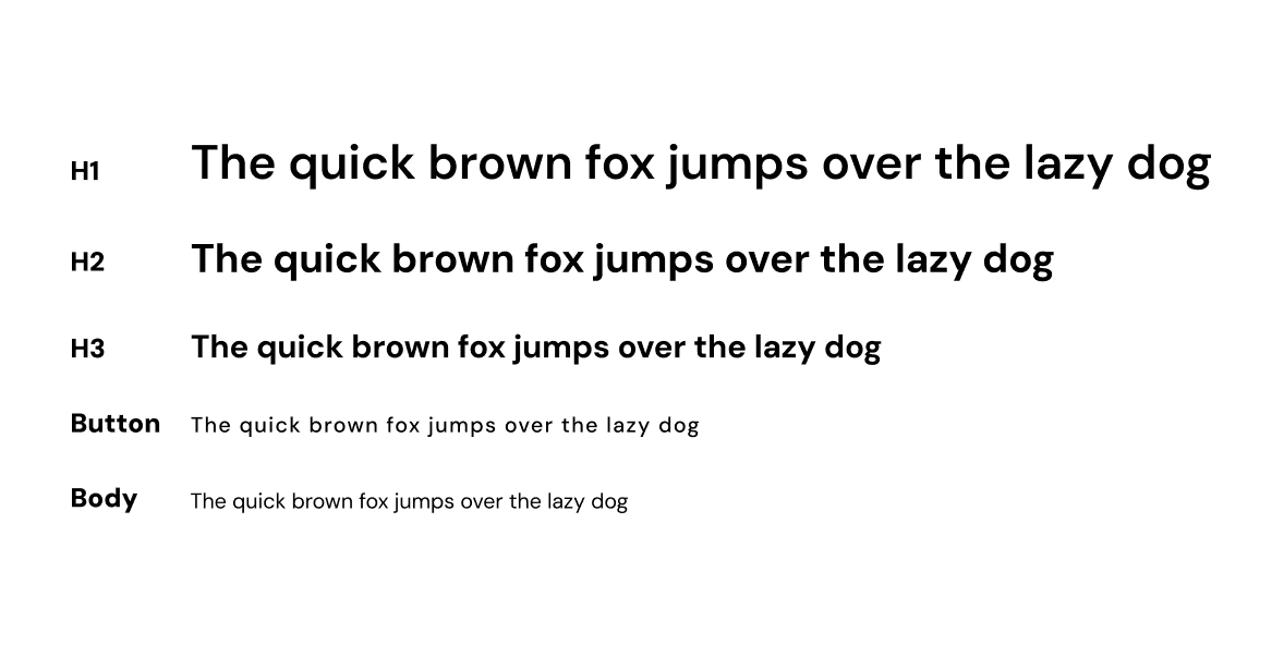
The geometry of DM Sans really stood out to me. The "g" in particular struck me as beautiful, and the shoulders of the "h," "m," and "n" were distinctive. Most importantly, it felt clean.
Conclusion
This project was incredibly fulfilling and, most importantly, I gained valuable insights from it. Going through the entire design process has helped me view it in a better light. During interviews, I received nothing but positive reactions to the product, which served as a significant motivation boost.
These are my key takeaways
This market is still untapped with a lot of potential.
I honed my skills in applying color consistently, enhancing the design system, and adopting a smarter approach.
The practice of restraint is important in any creative endeavor.
Shimmer is an ongoing project that I will continue to explore to see how far I can push it.
